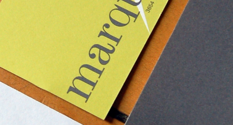
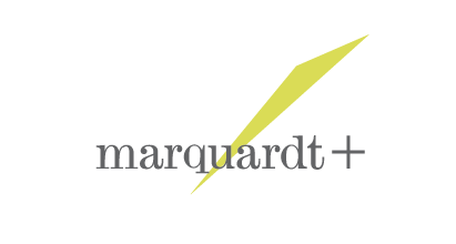
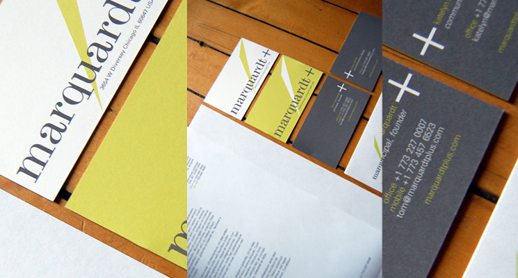
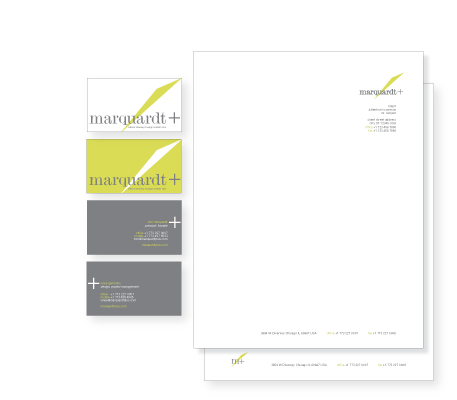
marquardt+ underwent a rebrand in 2011 when they updated their name from Design Collaboratives. The former logos each made reference to the shape of a #11 xacto blade, and it was imperative that this one did as well.
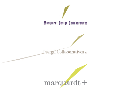
The colors were updated to a more intense green and a cool neutral gray to make the identity feel more modern, while still utilizing a more traditional serif typeface to communicate their vast experience.
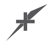
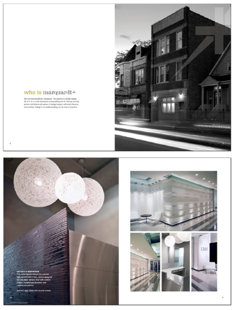
We also developed a “superhero” version of the logo for use as a watermark or as an accent on a wide array of collateral.